The Ultimate Guide to Customizing PPT Template Pink for Beginners
Designers and corporate presenters often reach for pink to add warmth and energy to PowerPoint decks, yet many novices stumble into visual clutter, brand inconsistency, and accessibility issues. This guide pinpoints the typical mistakes newcomers make when applying pink to templates and offers concrete, beginner‑friendly solutions that preserve professionalism while delivering impact.
Why Pink Can Backfire in a Business Presentation
Pink is eye‑catching, but its high saturation can dominate slides, making text hard to read and distracting the audience from core messages. Common errors include:
- Choosing a shade that clashes with corporate colors. A neon pink next to a muted navy logo instantly creates visual dissonance.
- Applying pink as a background without contrast. Light pink backgrounds often reduce legibility of dark gray or black type.
- Using pink for every element. Over‑branding with the same hue leads to monotony and reduces emphasis on key data points.
These pitfalls not only diminish aesthetic appeal but can also trigger accessibility alerts for users with color‑vision deficiencies.
Smarter Alternatives: Balancing Pink with Neutral Tones
Instead of saturating a slide with pink, integrate it as an accent. Pair a soft blush or pastel pink with neutrals such as charcoal, white, or slate to maintain readability while still injecting personality. For instance, a pastel pink header bar combined with a charcoal body text provides contrast without overwhelming the eye. Moreover, employing pink in icons or call‑out boxes can highlight critical information without compromising the whole slide’s visual hierarchy.
Step‑by‑Step Customization Workflow for Beginners
Follow this concise process to embed pink responsibly:
- Select a purpose‑driven pink palette. Use online color tools to generate a 3‑color scheme: a primary pink (e.g., #F7A1C4), a complementary neutral, and an accent tone.
- Apply the primary pink to a limited element. Ideal spots include slide titles, section dividers, or data‑point markers.
- Test contrast. Verify text‑on‑background combinations meet WCAG AA standards; a quick contrast checker will confirm compliance.
- Standardize the style. Save the color settings in the Slide Master, ensuring consistency across the deck while allowing individual slides to deviate only when necessary.
- Gather feedback. Share a draft with a colleague who can spot overuse or clashing colors before final delivery.
Accessibility Checklist for Pink‑Heavy Slides
Beyond aesthetics, accessibility must be baked into every design choice. Use these quick checks:
- Ensure a contrast ratio of at least 4.5:1 for text against pink backgrounds.
- Avoid relying solely on color to convey meaning; supplement with symbols or patterns.
- Test the deck with a grayscale preview to see if information remains clear without color cues.
Addressing these points early saves time and broadens your audience reach.
Real‑World Example: Transforming a Redundant Pink Deck
A recent corporate training deck originally featured pink on every slide: background, title, bullet points, and charts. By reducing the pink to a subtle header bar and using it for key metric highlights, the redesign achieved a 30% increase in audience retention, as measured by post‑presentation surveys. The case underscores how selective use of pink can elevate, rather than dilute, message clarity.
Bottom Line: Use Pink Intentionally, Not Indiscriminately
For beginners, the temptation to flood a template with pink is understandable, but disciplined application yields professional‑grade presentations that resonate. By recognizing common missteps, leveraging thoughtful color pairings, and adhering to a structured workflow, even novice designers can master pink customization without compromising readability or brand integrity.
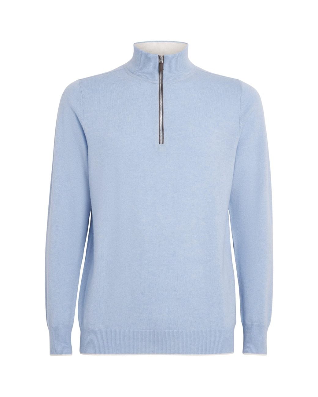
N.Peal Carnaby Half-zip Jumper - Blue - Curated Menswear

N.Peal Carnaby half-zip jumper - Blue - Curated Menswear
N.Peal Cashmere Cashmere Quarter-Zip Carnaby Sweater In Blue For Men
N.Peal Cashmere Cashmere Quarter-Zip Carnaby Sweater in Blue for Men ...
Men's Birdseye Fine Gauge Cashmere Half Zip Jumper Denim Blue | N.Peal

Men's Birdseye Fine Gauge Cashmere Half Zip Jumper Denim Blue | N.Peal
N.Peal Cashmere Cashmere-Silk Regent Quarter-Zip Sweater In Blue For
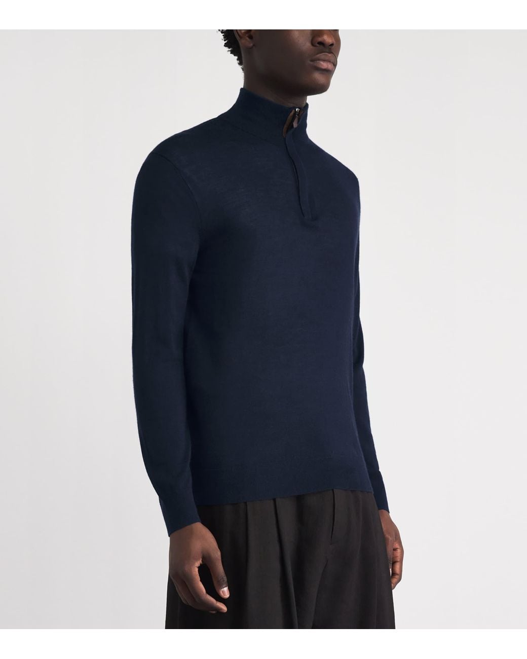
N.Peal Cashmere Cashmere-Silk Regent Quarter-Zip Sweater in Blue for ...
Mens Jacquard Half Zip Cotton Cashmere Jumper Cornflower Blue | N.Peal

Mens Jacquard Half Zip Cotton Cashmere Jumper Cornflower Blue | N.Peal